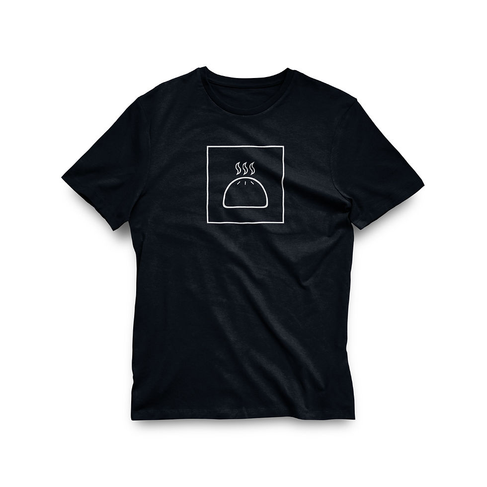
Director Ken Galloway spent years after graduating in Toronto’s Little Tibet eating saucy momos and scheming how to make “videos for good.” So when the time came, it made sense to name his production company “Saucy Momo.” And so, the Tebetan momos served as the source of inspiration for the design. Ken’s vision for his brand was minimalist yet fun. The logo lockup was created by pairing a steamed momo symbol with a slim, condensed font. The momo symbol was designed with a thick, “doughy” strokes that contrasted with the fine letting of the wordmark. A brand package, including stationary, t-shirts, and two types of business cards, was developed. A smaller, square version with general company information, intended as an economical option leave-behind, and personalized standard-size business cards designed for high-end business opportunities and direct connections.
Saucy Momo
Logo + Merch


